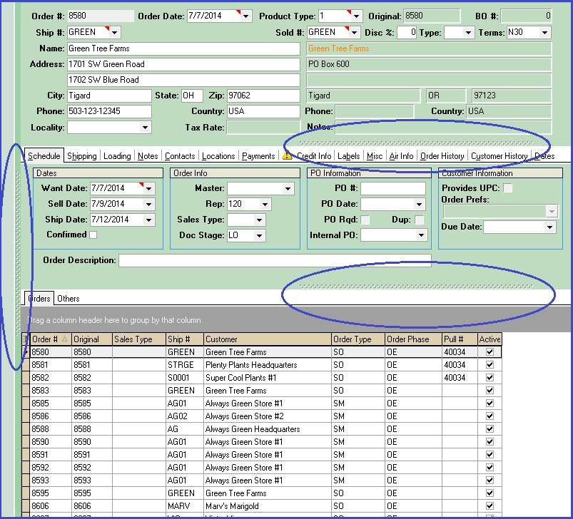
The CompuPlants Workspace
The CompuPlants user interface, including Platinum and Gold, is full of flexible, customizable features that help you get the most out of your nursery software.
Screen Layout
The following components make up the CompuPlants user interface. See screenshots below.
| Feature | Description |
|---|---|
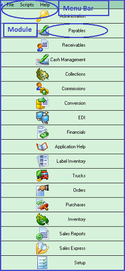
| Module | A major component of the program. Depending on which CompuPlants product you've ordered, some modules may be different than those shown on the screenshot below. |
| Menu | The main menu on the left-hand side of the screen. It consists of three tabs: a list of modules contained in the program (first tab), a module menu (second tab), and a customizable task menu (third tab). |
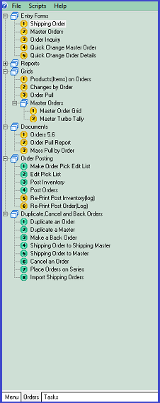
| Sidebar | When inside a module, the sidebar displays that module’s topics and subtopics in an expandable tree format. Double-click the plus signs (+) next to a tree branch to expand the files within. Double-click a menu tree item to open a new form. Each time you double-click a menu tree item, a new window opens. Window tabs accumulate along the bottom of the screen. Click “Exit” in the toolbar to close the form. |
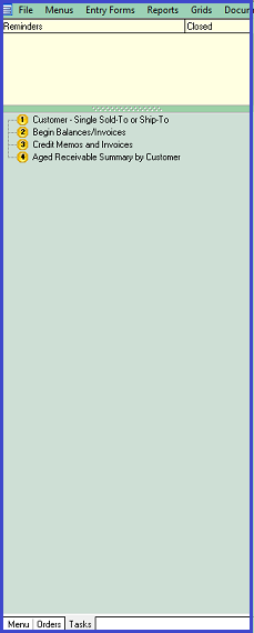
| Tasks Tab | On the third Menu tab, labeled "Tasks", you can create a personalized list of CompuPlants menu items. These may be menu items that you use frequently, or the tasks may be part of a to-do list. For instructions on setting tasks, refer to Set Menu Items as Tasks. You can also use the Tasks tab to set reminders. For more information, refer to Set Reminders. |
| Menu Bar | The menu displayed across the top of the screen. It defaults to “File / Setup / Help,” but, if you prefer, display all Menu items in the Menu Bar. Go to File > Show Items in Menu. |
| Toolbar | The row of action icons situated just below the Menu Bar. While these icons vary slightly by menu item, they generally include actions like “Find,” “Insert,” “Save,” and “Exit." |
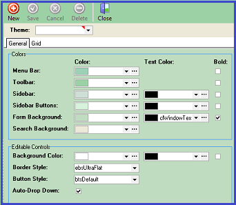
File > Themes allows you to customize colors for each component of the user interface. You can create several themes and save each one with a different name. Even if you do not plan to implement custom themes, experimenting with this feature early on can help you better learn CompuPlants' layout.
CompuPlants Screenshots
Menu / Module / Menu Bar
Sidebar
Tasks
Toolbar
*Toolbar icons vary by menu item.

Tip: Adjust screen views by sliding dotted lines vertically or horizontally:
Set Menu Items as Tasks
The Tasks tab collects menu items from across the various modules that you designate as tasks, creating a single task list that you can acess easily from any module.
- Navigate to the menu item that you'd like to designate as a task.
- On the module sidebar, right-click the menu item, then select "Add to Tasks". The menu item will be added to the Tasks tab.
-
*Only individual menu items can become tasks. Higher-level menu tree branches cannot be designated as tasks.
- Repeat Step 2 for each menu item that you wish to designate as a task.
- Click the Tasks tab at the bottom of the sidebar. All the menu items that you set as tasks will appear on this tab.
- (Optional) If you wish to organize multiple tasks into a folder, right-click the sidebar and select "New Folder". Enter the name of the folder, then click and drag the items that you wish to group into the folder.
- (Optional) Right-click an individual task to edit any of the following:
- Move Up
- Move Down
- Rename
- Delete
Set Reminders
At the top of the Tasks tab is a list of reminders. A reminder appears when today's date matches the start date you set for the reminder. A reminder can also be configured to invoke a specific menu item.
- From the Tasks tab in any module, double-click the Reminders column header and select "Edit Reminders". The Reminders form opens.
- Click "Insert".
- Enter a title for the reminder.
- Enter a start date and/or time. When a start time is set, the reminder will appear in the Reminders List at the designated time on the start date.
- Perform any of these optional steps:
- Deactivate the reminder. Note: Only active reminders appear on the reminder list.
- Enter any pertinent notes in the Notes field.
- Set a repeat interval: Enter a number in the Repeat Interval field, then select Days, Weeks, Months, or Years.
- For weekly reminders, you may instead choose the day of the week you wish the reminder to repeat.
- For reminders scheduled to repeat, you may wish to set a stop date/time.
- Set a warning for the reminder. The program applies this amount of time to the start date/time and shows the reminder on the Reminders List in advance of the designated start time.
- To link the reminder to a specfic menu item, select the module, then type the menu item ID. To find the menu item ID:
-
a. Navigate to the module where the menu item is located (if necessary).
b. Right-click the menu item and select "Edit Menu."
c. Copy the menu item ID (only the text that appears inside the quotation marks, not the quotes).
d. Paste the menu item ID into the Item ID field on the Reminders form.
- Click "Save."
- (Optional) Right-click the Reminders List and select "Refresh" to see new reminders. Note: The Reminders List is time-sensitive. Reminders will not appear until the designated start date/time. If a warning has been saved, the reminder will appear based on the amount of time entered in the warn fields.
When the reminder's start date and/or time arrives, it will appear in the Reminders List along with a checkbox to the right. Checking this box deactivates the reminder and removes it from the list. If the reminder is set to invoke a particular menu item, double-clicking the reminder will open the menu item you have associated with it.
Reports & Grids
Many tasks in CompuPlants involve gathering data and presenting it in an easily readable, organized fashion. Our reports and grids accomplish just that. Even more, their customizable features make your work flow smoother and faster. Similar to a spreadsheet, a grid allows you to sort and filter data, export to Excel, and much more. Find examples of Entry Form grids below:
| Pathway | Description |
|---|---|
| Inventory > Grids > Product Balances | This grid provides detailed product information, including quantity on hand, quantity shipped, quantity on reserve, and so on. |
| Orders > Grids > Changes by Order | This grid displays the development of a shipping order, including who created the order, what products were added/deleted, if prices were changed, etc. |
Add a Column
Click the Grid Column Selector, located in the upper-left hand corner of the grid (the icon resembles a bulleted list), which displays a list of all columns available for the grid you've generated. Add a column by checking the box next to column title.
Remove a Column
If a current column is empty or irrelevant to the information you need, remove it in one of two ways:
- Open the grid column selector and un-check the column.
- Or, click a column header on the grid, drag it towards the top of the screen, then drop it when you see a large "X" appear over the column name.
Shift Columns
- Open the Grid Column Selector. Click a column title and move it to the desired position.
- Or, click the column header on the grid and drag to the desired position. The green arrows act as a placement guide.
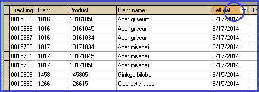
Sort Data
| Sorting Parameters | Procedure |
|---|---|
| Sort a single column | Find the light gray arrow in the column header. It points in the direction that the data is currently organized. Click the arrow to resort the data in the opposite order. Or, click in the column header—anywhere to the left of the sorting arrow—to sort data. Click a second time to sort in the opposite order.
|
| Sort multiple columns | Click the first column to sort, then hold down the Shift key and click on the next column to sort. |
| To clear a column sort | Hold down the Ctrl key and click the column heading. |
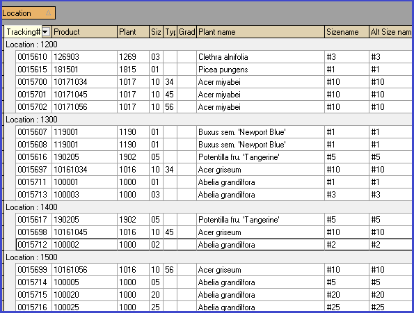
Group by Column
Grouping data creates distinct clusters of rows, offering another way for you to manipulate grids and organize information according to your needs. Drag a column header into the gray area above the table and release when the green placement arrows appear. To remove the grouping parameter, return the column to the grid or discard it by dragging it towards the top of the screen and releasing it once the large X appears. The group box must be turned on in order to use this feature.
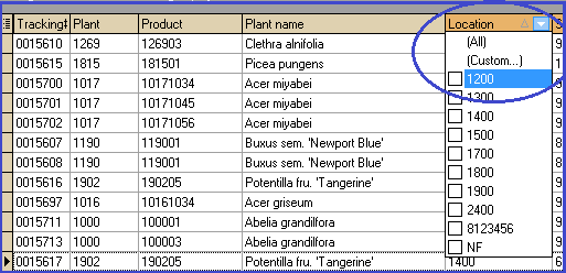
Filter Data
Easily filter a grid by clicking the bold arrow to the right of the light gray sorting arrow in a column header (it only appears when the mouse hovers the column header) . The program sifts all the cell values in the column and returns a drop down list consisting of all unique values. Click a value and the grid refreshes to show only those rows with the selected value.
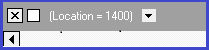
Alternatively, type the filtering criteria in the filter row, then press Enter. When turned on, this row is located just beneath the column header. To clear the filter, click "All" in the filter drop down list, or click the "X" in the bottom left corner of the form.
In the bottom lefthand corner, the program stores each filter you apply and provides a shortcut to them. Toggle a filter on/off by checking the box to the right of the X; switch to a previous filter by clicking the drop down arrow to the right of the filter criteria. Lastly, you can further customize the filter by clicking the "Customize" button in the bottom right-hand corner. Filters are not saved upon exiting the program.
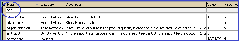
Wildcard Search
When filtering a grid or conducting any search in the application, use the asterisk (*) to obtain all records that share a common string of characters (letters and/or numbers). Known as a "wildcard" search, the placement of the asterisk determines which results the search yields. See the table below for examples of wildcard searches for plant/product numbers.
| Example Query | Results |
|---|---|
| 1904* | Returns all product numbers beginning with "1904" (e.g. 190401, 190405, 190420) |
| *01 | Returns all product numbers ending in "01" (e.g. 100101, 124501, 9001) |
| *904* | Returns all terms that contain the specified string of characters (e.g. 190401, 290425, 490405) |
| 19*0 | Returns all product numbers that start with the number sequence "19" and end with "0"; there may be any number of characters between the beginning and ending characters (e.g. 1900, 1910, 1920). |
The wildcard search below will filter all admin options to those beginning with "oe" (for order entry).
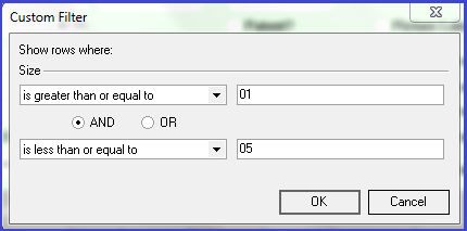
Custom Filters
This is a sophisticated filtering tool that affords you more options for filtering data. You can filter contents to records that equal, do not equal, are less than (or equal to), greater than (or equal to), are blank or not blank. You can then further customize the filter by clicking the "Customize" button in the bottom right-hand corner (see Step 4).
Apply Custom Filter:
- From the entry form grid, determine which column will serve as the primary filter.
- Click the filter dropdown arrow in the column header, then select "Custom." A dialog window appears.
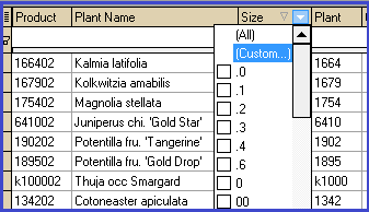
- In the dialog window, enter the filter conditions, then click OK:
- After creating a custom filter, a filter info bar appears at the foot of the screen, allowing you to:
- remove the filter (click "X")
- toggle the filter on and off (click check mark)
- toggle to a filter you've applied previously (select drop down arrow)
- or further customize the filter

Further customize the filter:
- Click "Customize" in the bottom right-hand corner of the screen. The Filter Builder dialog appears, showing the conditions that have already been passed to the current table.
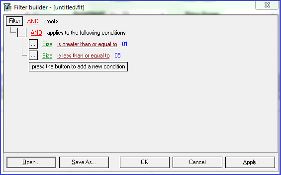
- Select the level(s) at which you wish to add another condition or group of conditions:
- Click the box labeled "Filter" to customize the filter at the root level (i.e. the original table)
-
* You may also wish to change the operative (AND, OR, NOT AND, NOT OR) at the root level.
- Click the box next to the existing condition or condition group to further filter the current table.
- Select "Add condition" to add a single condition under the same operative, or "Add Group" to add a condition with the option to change the operative.
- Determine the parameters that will be passed to the data.
- (Optional) Add more conditions as desired.
- Click "Apply".
- (Optional) Save custom filter (see instructions below).
- Click "OK" to exit the Filter Builder dialog.
Save Custom Filter
- In the Filter Builder dialog window, after establishing all conditions you wish to apply, click "Save As." Windows Explorer opens.
- Change the location where the .flt will be saved and give it a unique name. It is not automatically saved in your CompuPlants' temp folder, as other program modifications are, so you can create a CP folder in your Documents directory, or wherever you like, and store custom filter files there.
- The next time you wish to implement the filter, open the Filter Builder dialog and select "Open" (a filter must be active in order for the "Customize" button to appear in the bottom right-hand corner). Windows Explorer will open once again.
- Navigate to the .flt, double-click it. The saved filter overrides all conditions for the previous filter.
- Click "Apply", then "OK" to exit the dialog.
Grid Popup Menu
The popup menu, accessible by right-clicking any area of a grid, offers more workflow tools. Note that these menu items will vary depending on the type of grid you are working with (entry form grid or report grid).
| Menu Item | Description |
| Reset Grid | If you've added, removed, and/or rearranged columns, this command restores the grid to its default display. |
| Print Grid | Click this to send the grid to our integrated DevExpress design interface, where you can change fonts, reorient the page layout, change the title, alternate background colors by row, add page numbers, and much more. With v7.0, you can save "styles" (see the Styles tab in the Design dialog window), and easily apply them for future printing. |
| Print Custom Grid | Currently offers the same capabilities as "Print Grid". |
| New Grid Layout | Creates a new grid layout under a separate tab. Customize as you please. Right-click on grid tab to rename or delete.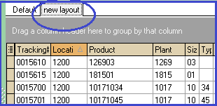 |
| Upload Grid Layout | Uploads a new grid layout so it is accessible the next time the program is opened. You can also share grid layouts with other users by copying files to their workstations. Learn more in the Data Storage section. |
| Export to Excel | Saves grid as file type .xls. |
| Email as Excel | If using CompuPlants Platinum 6.0, you must use the Thunderbird email client or a pre-2013 version of Outlook in order to email a grid or report as an Excel spreadsheet. If using Outlook 2013, this feature works for Outlook admin users. |
| Show/Hide Group Box | Controls the area for grouping by column. |
| Show/Hide Filter Row | Controls the row for filtering data. |
| Show/Hide Summaries | When active, a totals row appears at the bottom of the screen. This applies to reports only in version 6.0, and reports and entry from grids in version 7.0. |
| Align Column | Quickly justifies text to the left/right margin, or center. *Available with version 7.0. |
| Format Number | Currently unavailable. |
| Highlight | Choose from pre-set color schemes in Admin > Cell Styles. *Available with version 7.0. |
Quick-Change Grids
Quick-change grids allow you to quickly and easily edit data in bulk. This can be useful when changing sell dates, applying price changes, and scheduling activities. Not all grids are quick-change—column headers with orange backgrounds indicate that those fields may be edited.
Apply Changes
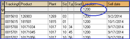
When you change information on a quick-change grid, all the associated records are updated as well. You may not add or delete records from a quick-change grid.
- To change a single cell: click in the cell and type new text, then click "Save."
- To change several rows in a single column: Highlight the rows you wish to change (see below for highlighting instructions), then right-click on the column header and select "Quick Change." Enter new text and click "OK."
| Highlighting Technique | Procedure |
|---|---|
| Highlight sequential rows | Click on the first row in the group, hold down Shift, then click the last row in the group. All rows from first to last will be highlighted. |
| Highlight non-sequential rows | Hold down Control, then click the individual rows you wish to change. Alternatively, sort or filter as desired, then highlight as a sequential group. |
| Highlight all rows | Press Control-A. |